
How a 1990s web trick shaped our new brand imagery tool
A project came my way recently: putting together guidelines for imagery and illustration across the company, and a repeatable system to go with them rather than building every image from scratch. I ended up basing that system on a shape that had been sitting in our own logo the whole time.
A quick history of the logo
The logo traces back to a sketch of a fluorescent lightbulb, with its coiled tube simplified into a set of horizontal lines. Those lines gradually became the letter F. That F was then merged with an earlier metaball design of mine, one representing fluidity, and together they formed the logo as it stands now.
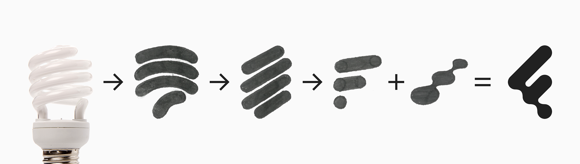
If you haven’t come across the term, a metaball effect is what happens when two blobby shapes get close enough that they merge into one continuous form, rather than just overlapping. Think lava lamps, or the way two drops of water pull into each other just before they touch. It’s a soft, organic way for shapes to join, one that made sense for a company that talks about fluidity as a value. There’s something fitting too about a natural-feeling shape sitting at the heart of our logo, given that we take the environment seriously.
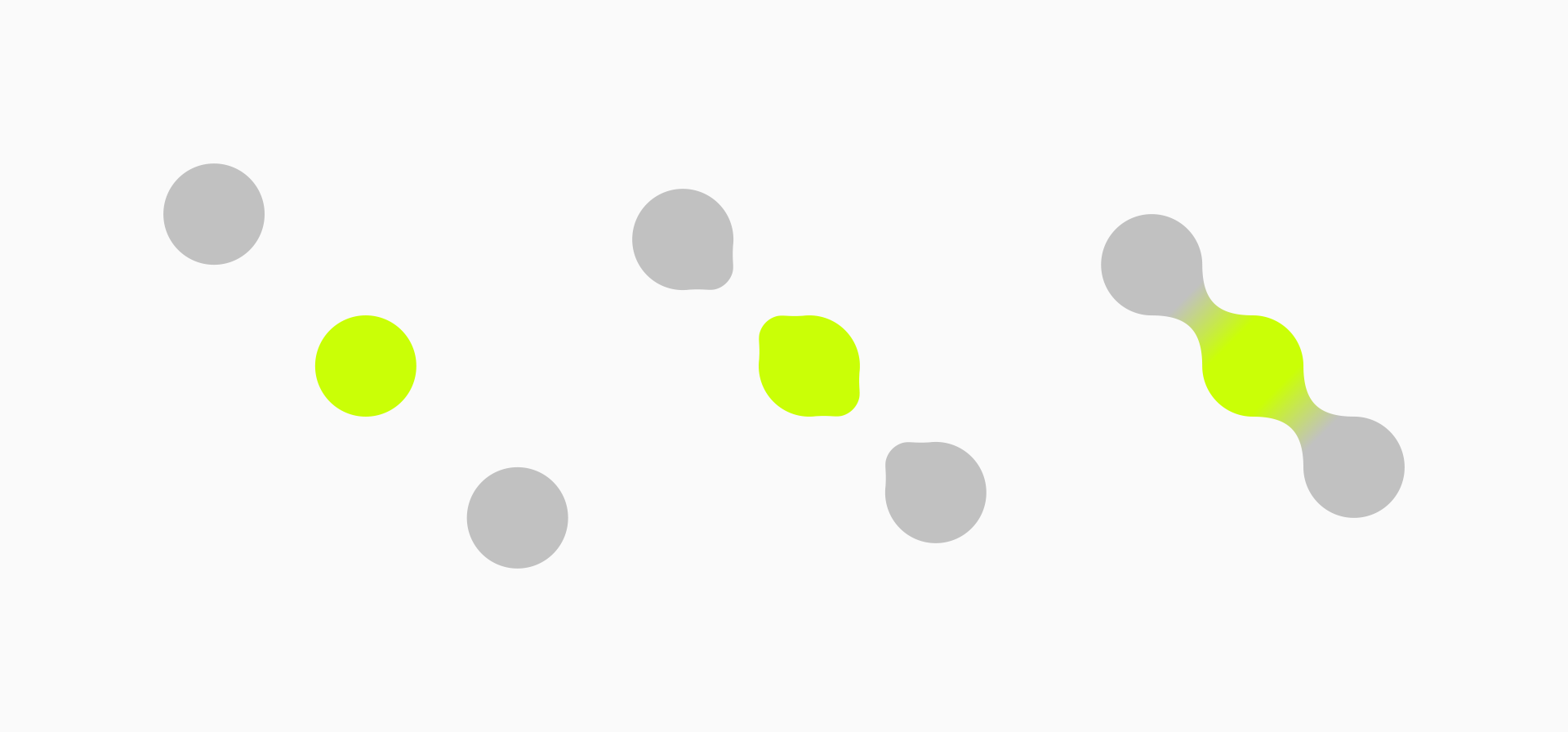
From logo to pattern
Not long after the logo was finished, I noticed the metaball shape didn’t have to stay locked inside the F. Repeated and scattered, it worked as a pattern in its own right. That pattern started turning up everywhere: decorating social media posts, filling out slide decks, generally becoming a bit of a visual signature for the brand beyond the logo itself.
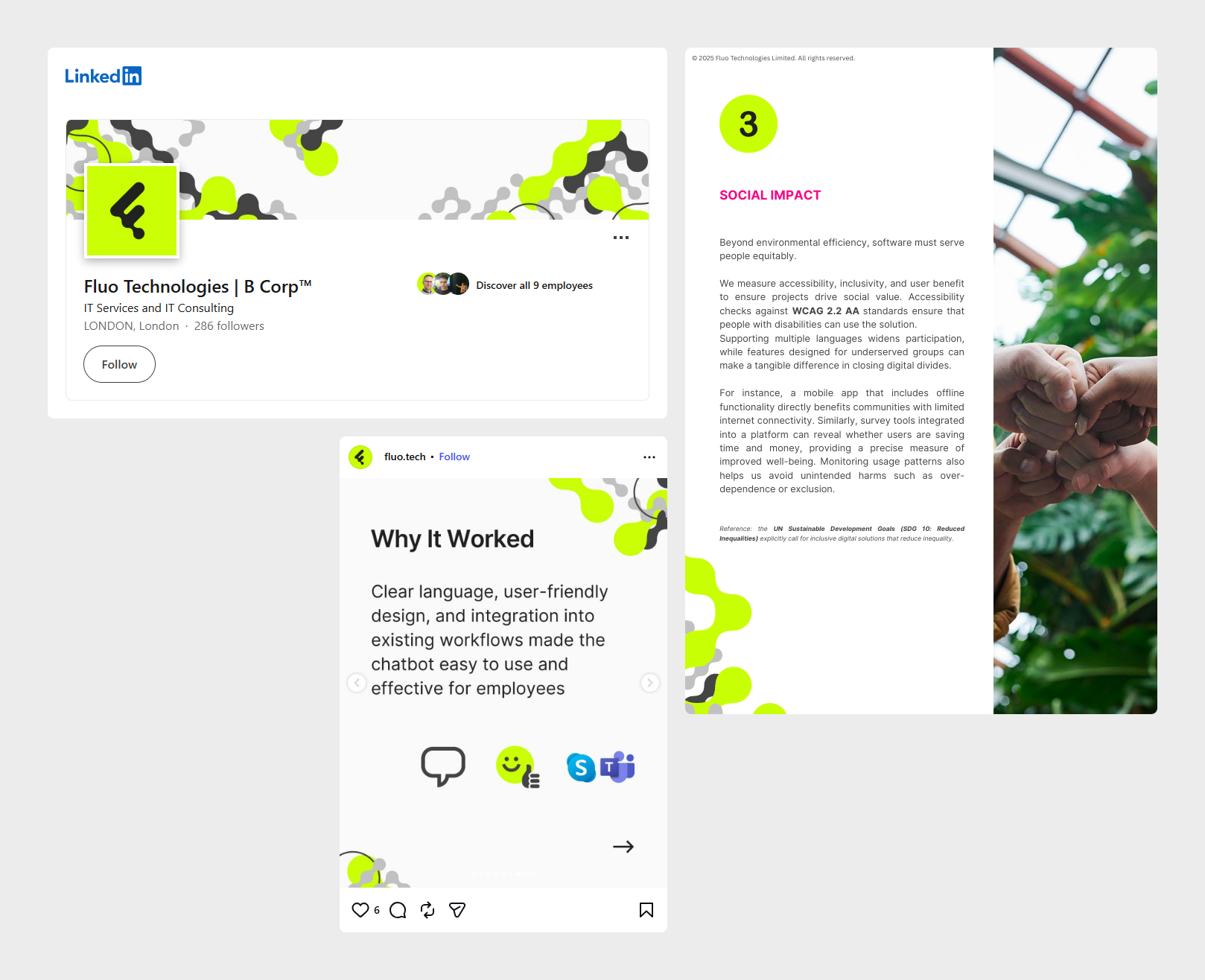
The pattern-making stayed fairly manual for a long time. It worked fine for one-off graphics, but it was never going to scale, and I needed something repeatable rather than starting from scratch every single time.
Digging into indexing
The answer ended up coming from an older piece of internet history: image indexing. It’s a leftover from the early web, from a time when you couldn’t upload a high-resolution image without it taking forever to load. The workaround was to cut down the number of colours in an image, which shrank the file size dramatically. That process is called indexing. It’s a fitting thing to dig into for a company that does web and app development, since it’s genuinely part of the web’s own early toolkit, not just a random bit of nostalgia.
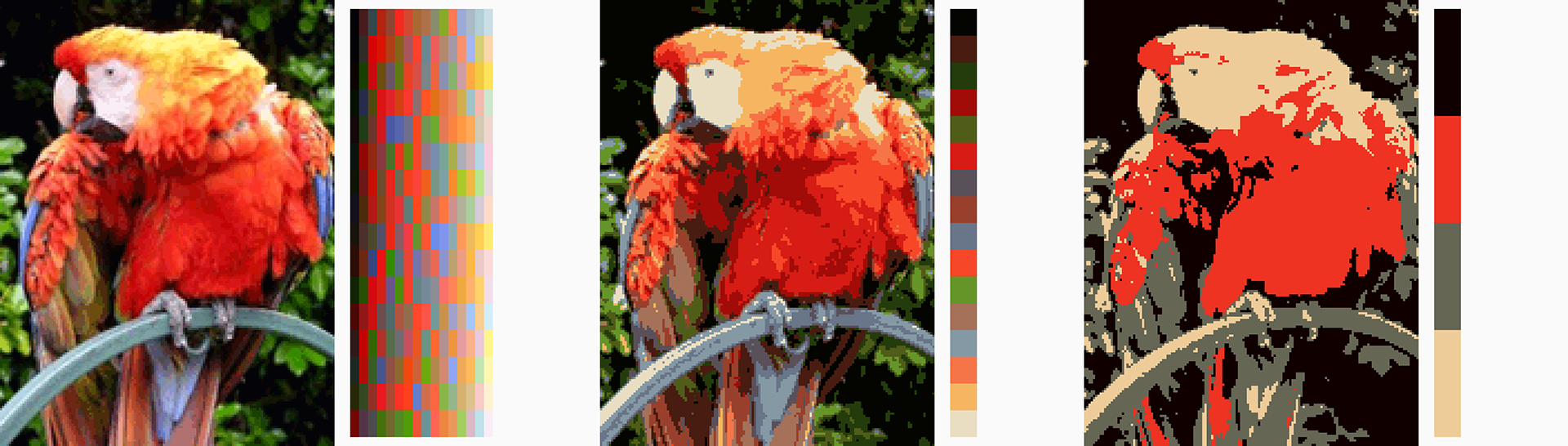
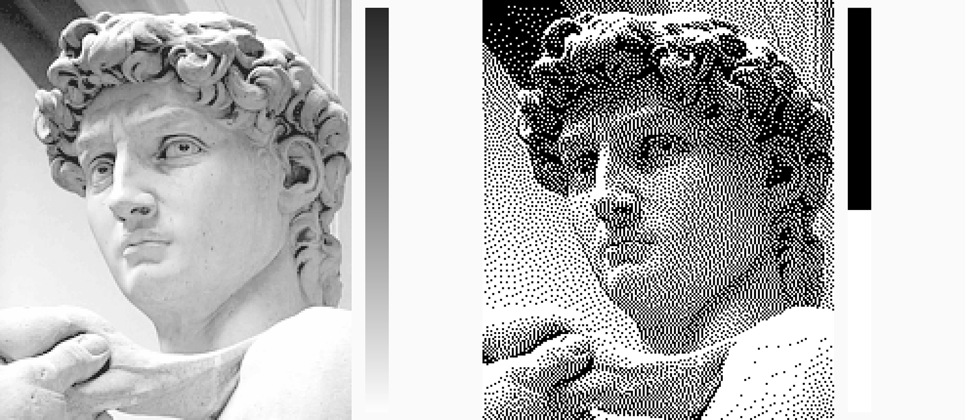
What indexing does to an image visually is the interesting part. Cutting the colours down doesn’t just shrink the file, it also produces these strange, blocky, almost painterly effects, particularly once dithering comes into play. Dithering scatters the available colours in patterns to trick the eye into seeing a smooth gradient, even though the palette itself is too limited to produce one directly.
Over the years I picked up other tools that paired well with indexing. One was a bitmap-to-vector tool by Arjan Westerdiep (drububu.com). An indexed image is still just a grid of coloured pixels, while a vector image is built from shapes and paths that can scale to any size without losing quality. His tool did exactly that conversion, taking an indexed bitmap and turning every single pixel into its own one-by-one pixel square in an SVG.
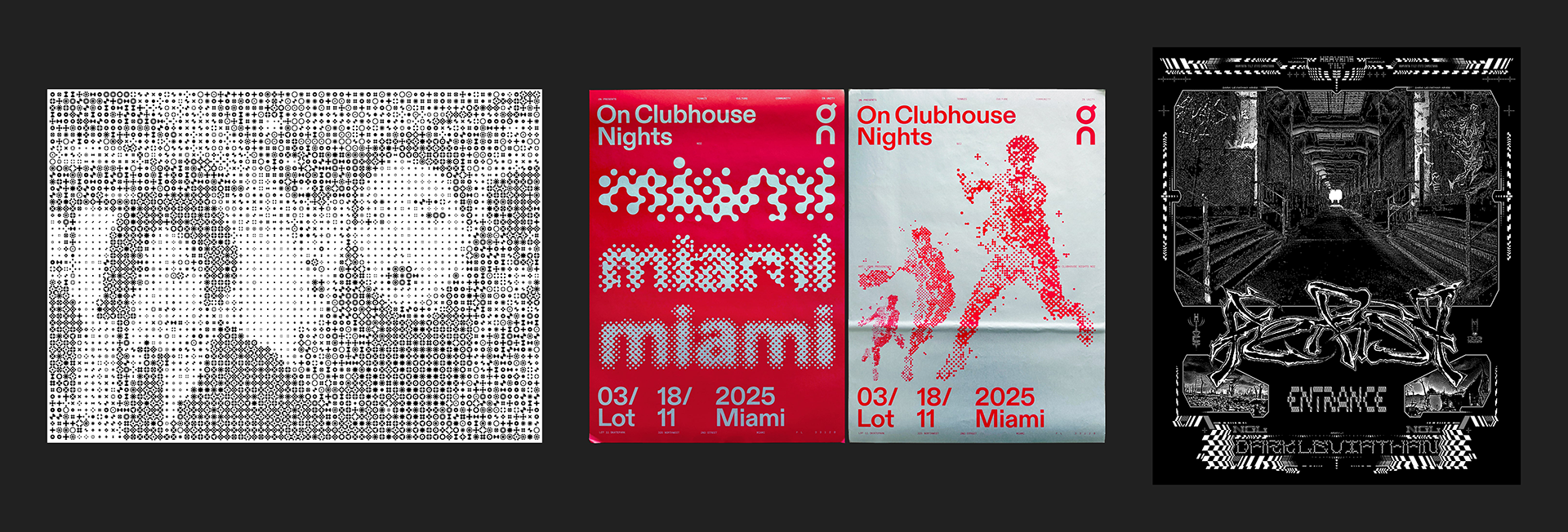
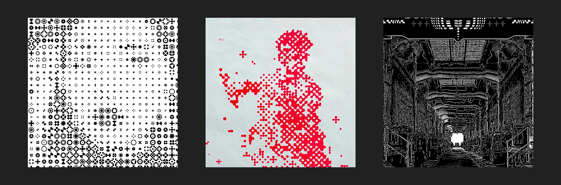
Around the same time, I kept returning to a handful of visual influences: Karel Martens, John Provencher, David Rudnick. At that point, this technique, those influences, the logo, and the manual metaball pattern were just separate interests, sitting side by side with nothing tying them together yet.
The early process
Eventually, all of it did come together. Here’s what the early version of the process looked like:
- Use GIMP, a free, open-source alternative to Photoshop, to resize, index, and dither an image.
- Run the result through drububu’s bitmap-to-vector tool to convert it into an SVG, with every pixel becoming its own square.
- Open the SVG in Illustrator and round the corners of every square at once, turning them all into circles.
- Use an Illustrator script by Hiroyuki Sato to join pairs of circles together with a metaball effect, one pair at a time.
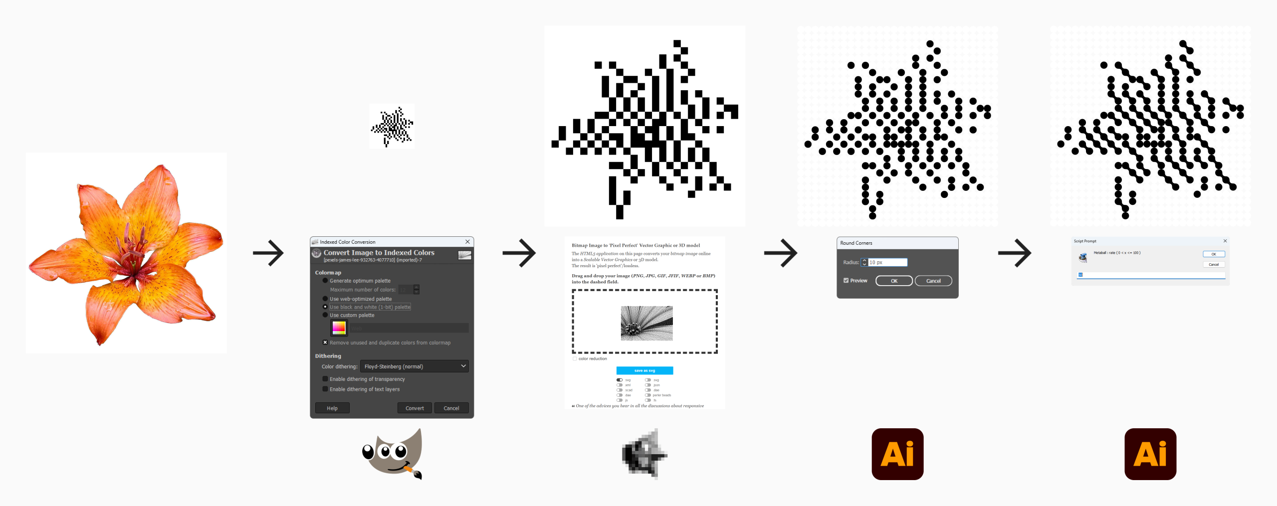
It worked. The results looked like the effect I wanted. But step four was brutal. Selecting pairs of circles by hand across a whole image, one join at a time, was not a viable way to work.
A first attempt at automation
The obvious next step was to automate the metaball connections. With Claude’s help, I built a script for Illustrator that could work out which circles were sitting next to each other and apply the metaball effect automatically, rather than me clicking through every pair myself.
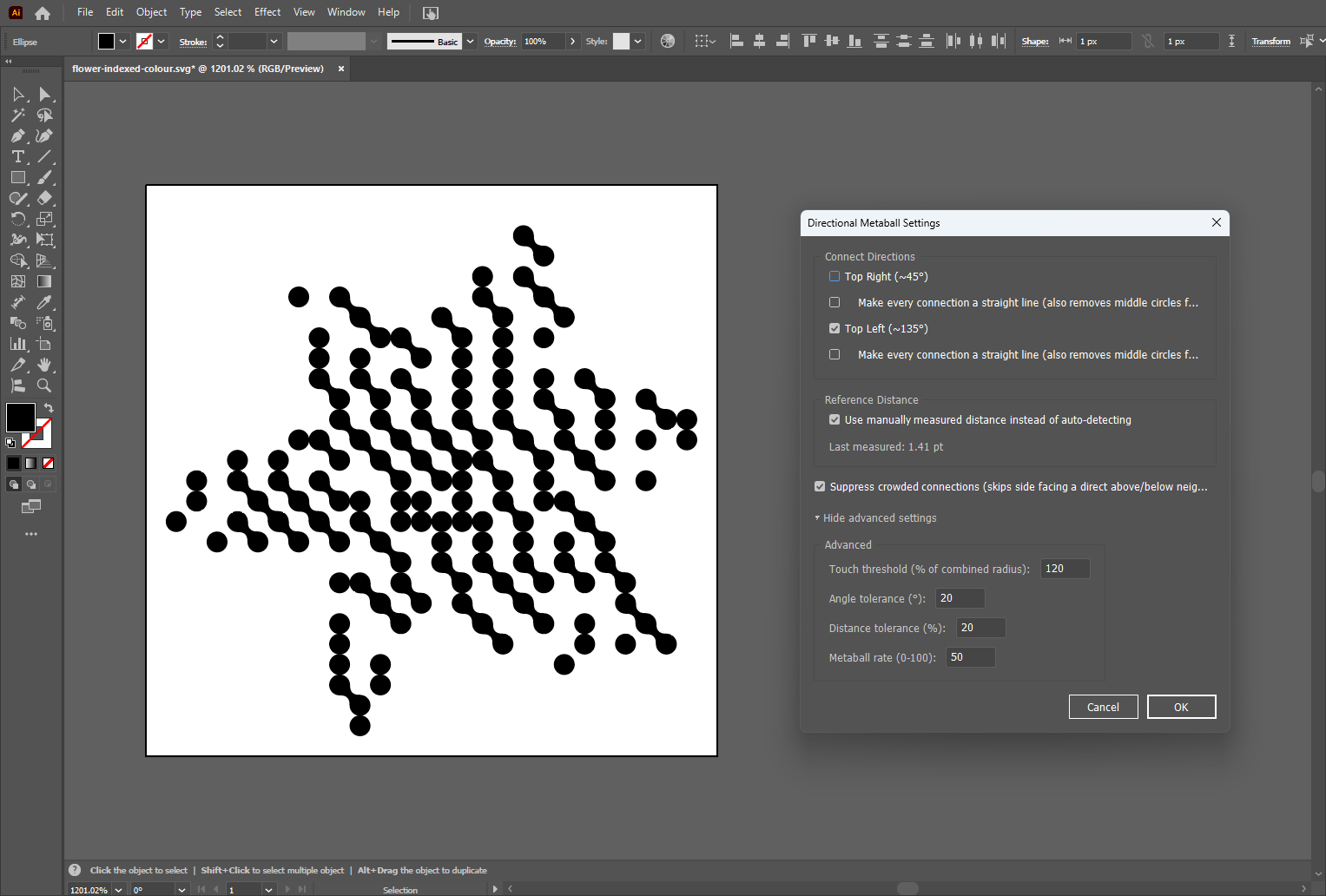
It worked, but Illustrator itself became the bottleneck. The effect ran slowly, especially on larger images, and the program would sometimes crash outright. Along the way I also ran into a more interesting problem: when too many circles sat close together, the metaball joins got crowded and messy. That meant coming up with my own rules for when a join should and shouldn’t happen, just to keep the output readable.
Moving to a standalone tool
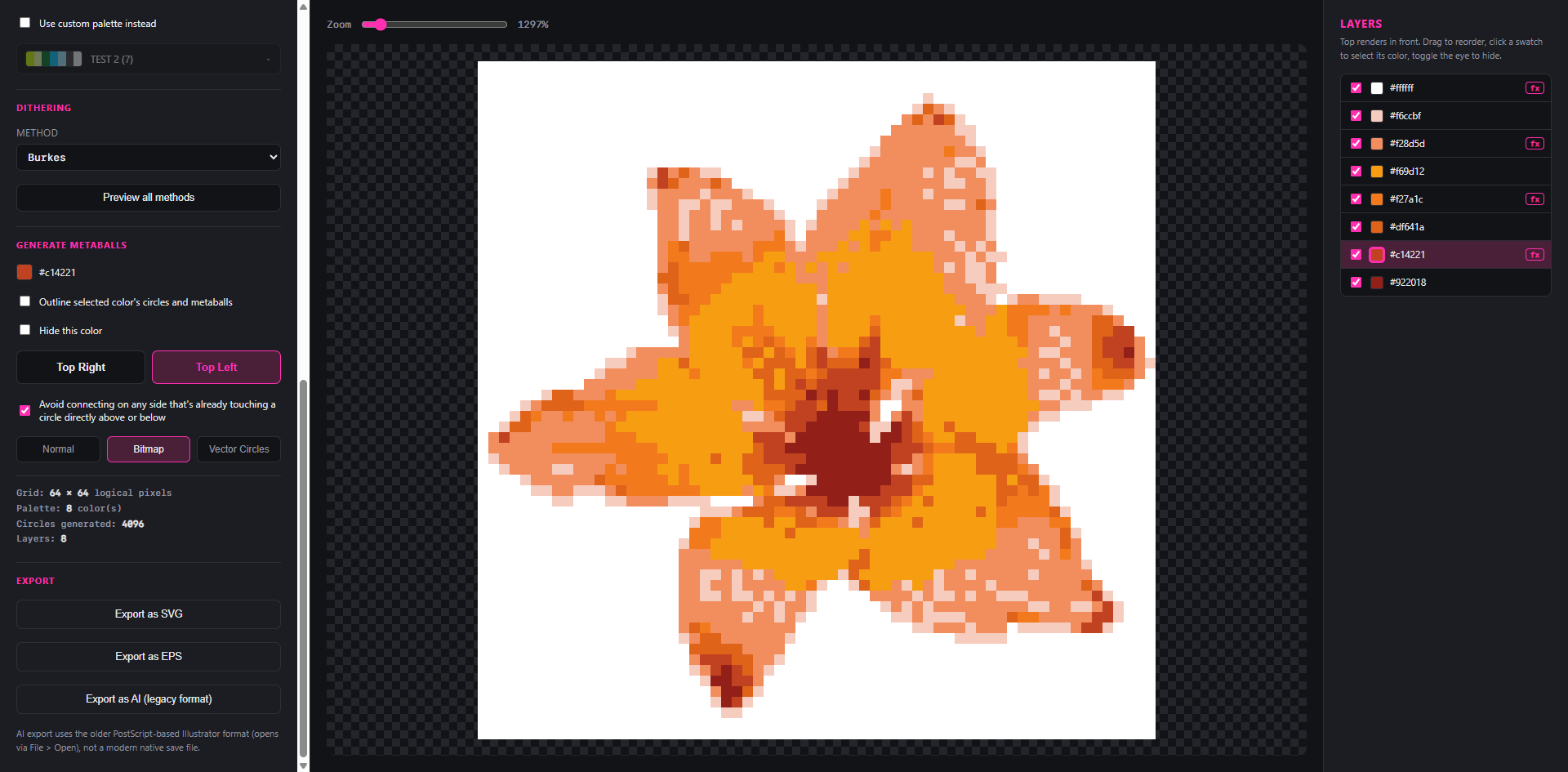
Eventually I got tired of waiting on Illustrator and decided to build the whole thing as a standalone tool instead, working with Claude throughout.
I started with the bare minimum, just enough to prove the core effect could actually work outside of Illustrator. Once that was proven, I added new features one by one, tackling whatever felt most essential first:
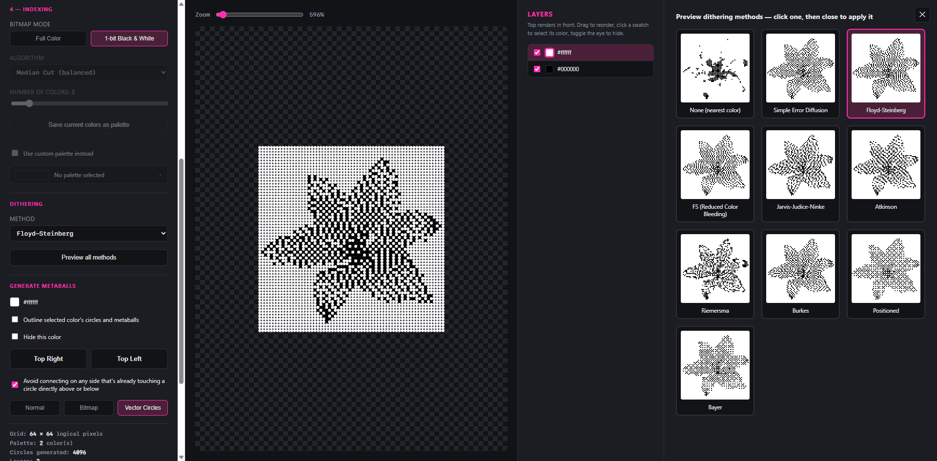
- Different dithering algorithms to play with. Dithering simulates the colour blends, and switching algorithms can make a real difference to how those blends look.
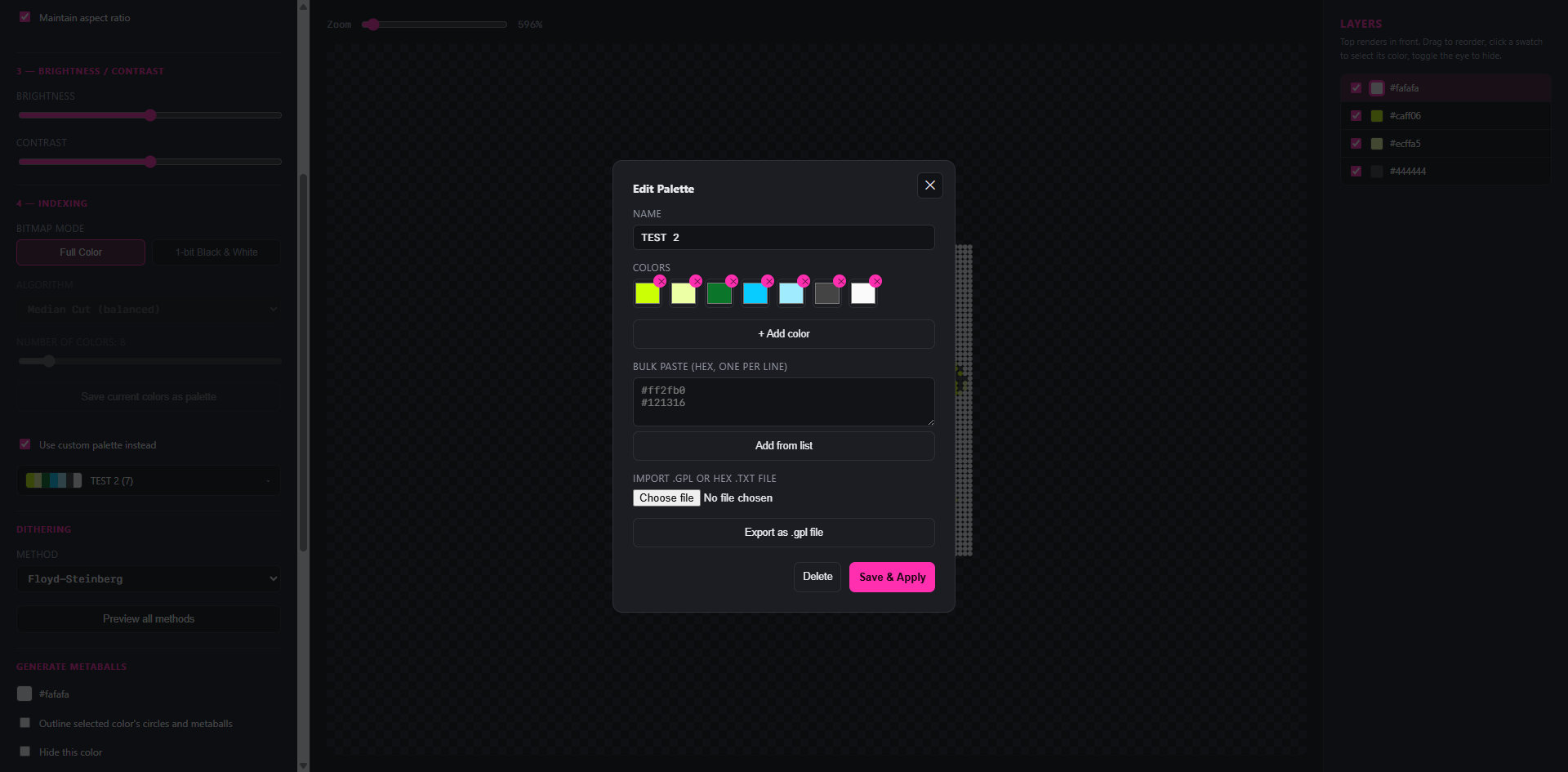
- The ability to build custom colour palettes, either by picking colours directly or typing in hex codes, and then apply them to an image.
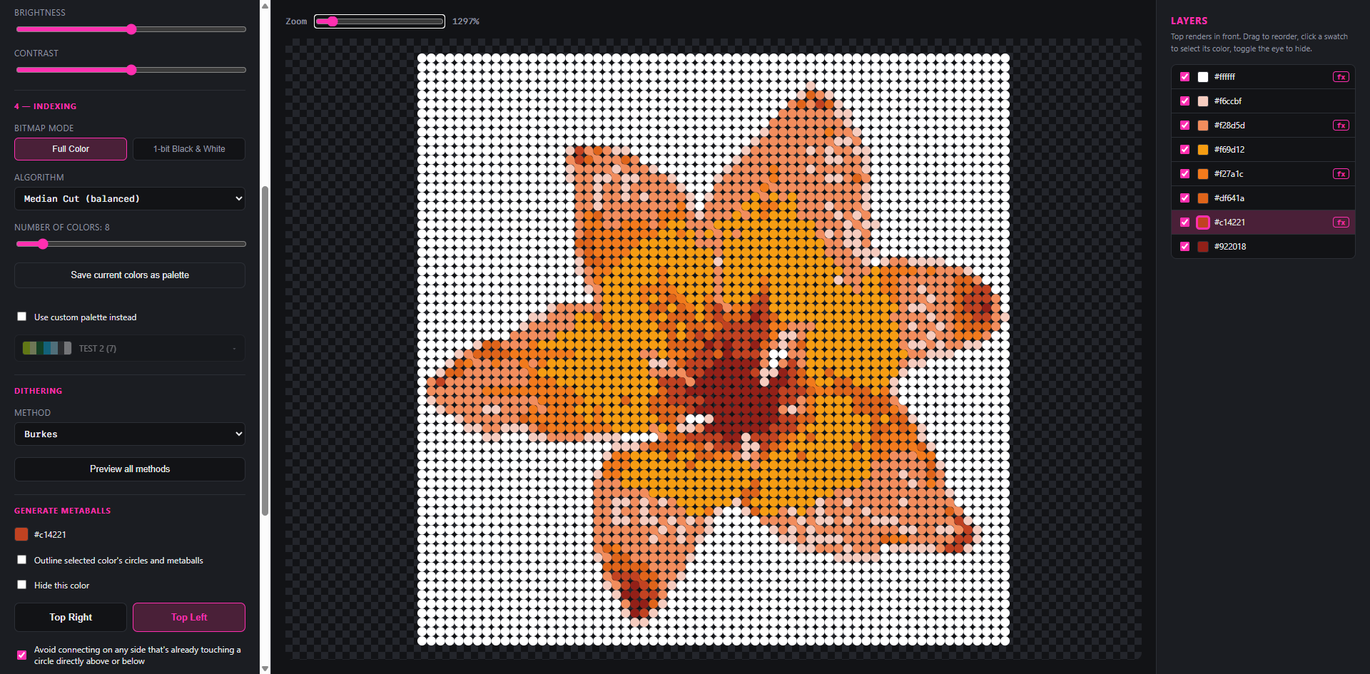
- A layers panel, since moving a colour up or down the stack changes how the connections between circles overlap with each other.
- A way to toggle between the original image, the indexed version, and the final circles-and-connections version.
One thing surprised me too: Claude packaged the whole thing into a single HTML file. That turned out to be useful, no juggling multiple files, just one thing to open and run.
The payoff
A process that used to require three separate tools and a lot of patience now runs almost instantly. And it’s a tool I can keep building on, rather than a script I’d have to rewrite whenever I want it to do something different.
That solved speed, but not consistency. Brand imagery needs a set of repeatable rules behind it, or everyone ends up making their own version of the effect. So I spent a couple of days feeding all kinds of images through the tool, testing what held up and what didn’t, and out of that came four methods.
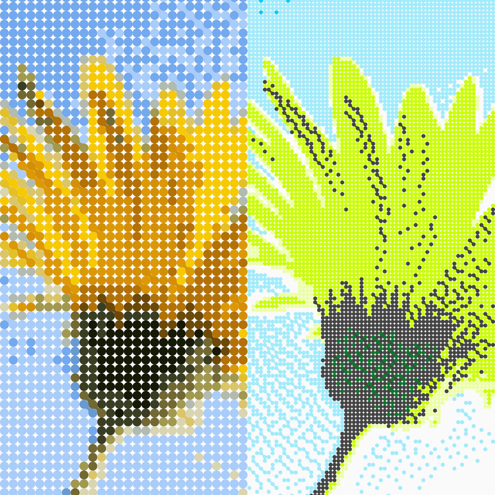
Full Colour
Full colour photography stylised with the dot pattern, using colours sampled either from the image itself or from the brand palette.
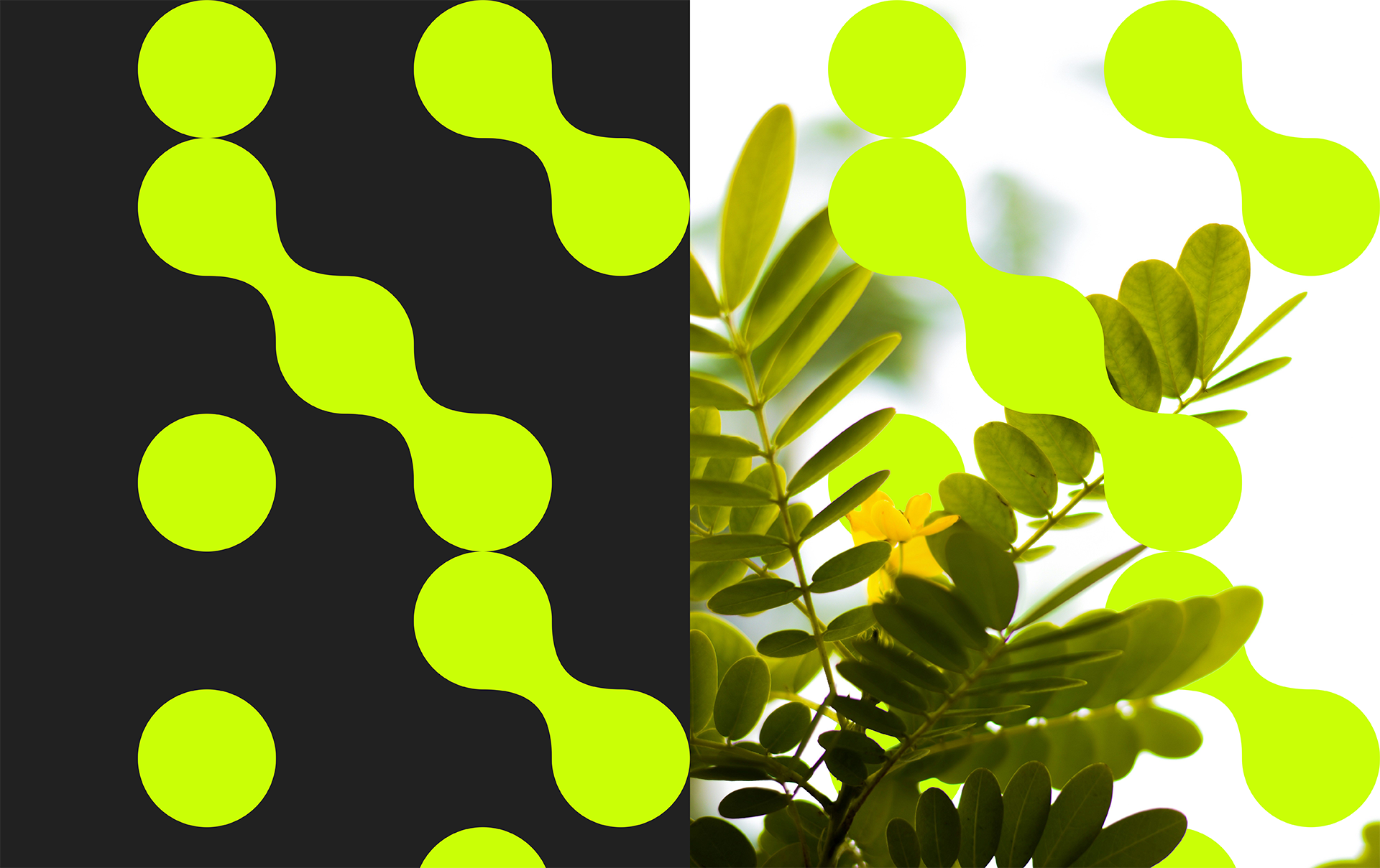
Fusion
An abstracted, dot pattern version of an image fused with the original.
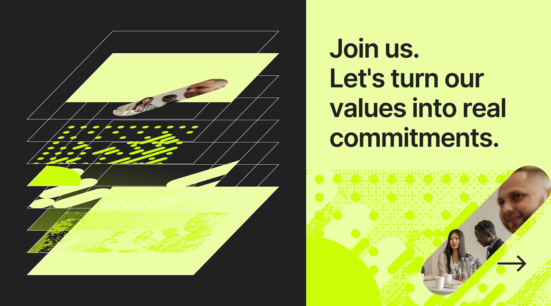
Layering
Multiple abstracted versions of an image layered together to build a background, using between two and four layers of dots at different sizes, paired alongside other elements such as imagery and text.
Icons & Illustration
Icons and illustration made with the dot pattern, where the dots either build the shapes themselves or act as shading.
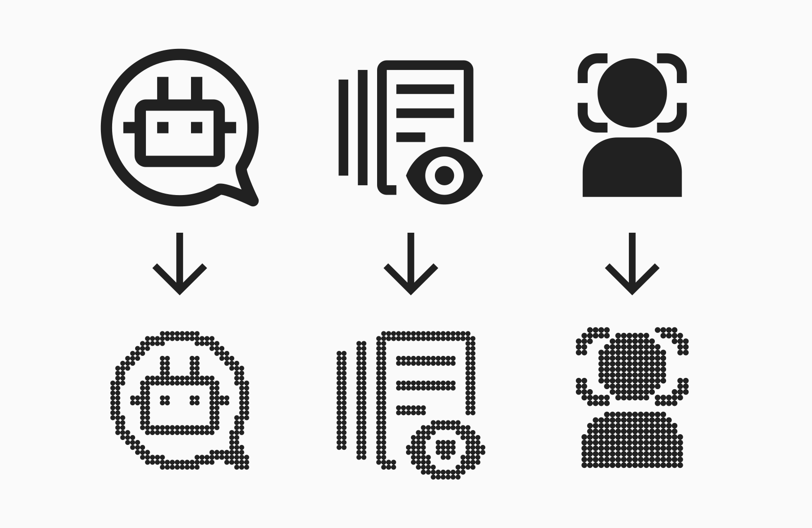
Part of the point of having four methods rather than one was flexibility: some jobs call for the pattern to dominate the image, others call for it to stay in the background. For example, running a photo of someone through Full Colour distorts their face, since the pattern covers everything indiscriminately. Fusion solves that: cut the person out, put the pattern behind them instead of over them, and the image still gets some visual flavour without wrecking the part that actually needs to stay legible. Same effect, four different approaches — each one chosen to suit the image at hand.
Not where it ends
What started as one shape in the logo has now become the basis for how the company produces its imagery. None of it was planned from the start. The shape just kept morphing into something new, the further I took it. And this probably isn’t where it stops. The four methods came out of a couple of days of testing, not months of research, so it wouldn’t surprise me if a fifth or sixth turns up once more people start using the tool and pushing it in directions I haven’t tried yet. The tool itself is still rough around the edges, and there’s more I’d like to add to it. For now, though, it’s doing the job it needs to do: giving the company a repeatable way to produce imagery that still looks unmistakably like Fluo.


